Getting started with CSS animations
How to use CSS Transitions
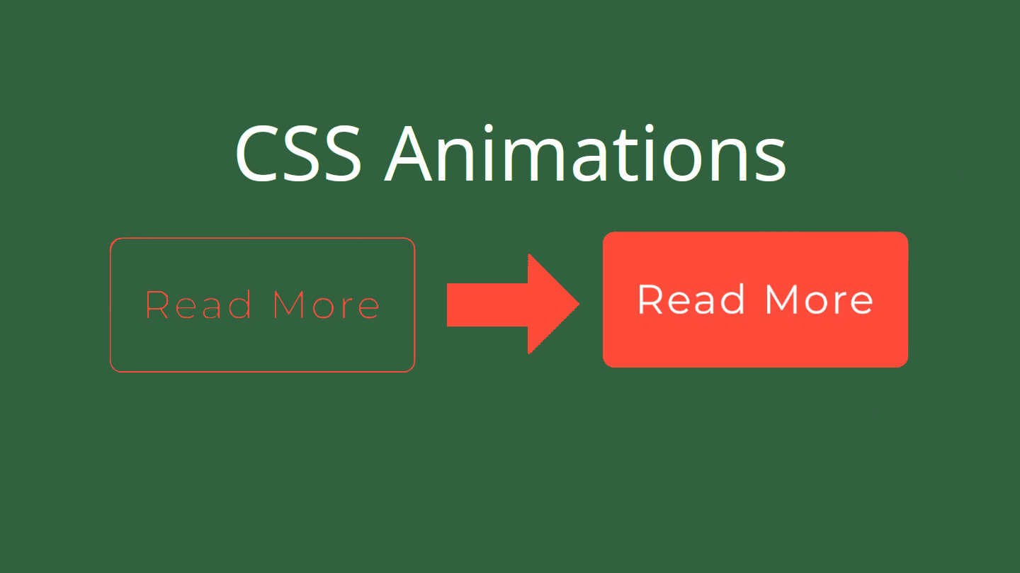
So you want to learn more about CSS animations. CSS animations a great and simple once you get to know them. For this example let's use a button. When a cursor hovers over this button we will change the color of the background for 0.3 seconds.
The basics for CSS animations is that the element starts with the starting position like background-color: transparent;, then on a hover event or any other CSS event changes to the end position like background-color: red;. To do this you need to set a transition with the animation duration. The best way to set transitions is by adding them to the starting position element like this.
.button {
	transition: background-color 0.3s ease;
}
A good template for transitions would look like this. The style can be anything like height, background-color, color, margin, padding, or if you want this transition to apply to everything then set it as all. Examples of the transition type would be ease, ease-in-out, ease-in.
.element {
	transition: [style] [duration in seconds]s [transition type];
}
With transitions, you can also add more than one different transition on the same element. For example, if you wanted a button background to take 0.3 seconds long and the border-color to take 0.4 seconds for the transition.
The full CSS for this demo button would look like this.
.button {
	background-color: transparent;
	border: 1px solid black;
	border-radius: 5px;
	margin: 1rem;
	padding: 1rem;
	transition: background-color 0.3s ease, border-color 0.3s ease-in;
}

.button:hover. .button:focus {
	cursor: pointer;
	background-color: red;
	border-color: red;
}
If you are using SCSS then the code would look like this.
.button {
	background-color: transparent;
	border: 1px solid black;
	border-radius: 5px;
	margin: 1rem;
	padding: 1rem;
	transition: background-color 0.3s ease, border-color 0.3s ease-in;

	&:hover,
	&:focus {
		cursor: pointer;
		background-color: red;
		border-color: red;
	}
}
If you want to see this code in action, here is a Codepen for the code above.
How to use CSS Keyframes
CSS keyframes can be used for more complex animations that can't be done with a simple transition. With CSS keyframes you can have many things about an element change at different times throughout the animation.
Let's get right into the @keyframes, there are two ways to set the progression of keyframes. One is with from and to where the animation starts from and ends at to. The other method is using percentages, where 0% is the starting style and 100% is the end style. Here is an example of both of these methods.
@keyframes fade-in {
	from {
		opacity: 0;
	}
	to {
		opacity: 1;
	}
}

@keyframes slide-in {
	0% {
		opacity: 0;
		transform: translateX(1rem);
	}
	50% {
		opacity: 1;
	}
	100% {
		transform: translateX(0);
	}
}
If you would like to set one movement for 40% at the start of an animation, you would do that like this.
@keyframes fade-in {
	0%,
	25%,
	40% {
		opacity: 0;
	}
	,
	100% {
		opacity: 1;
	}
}
With CSS animations you have to specify a few things for the element getting the animation before a @keyframes will work. The minimum for setting a keyframe is adding the name of the keyframe and the duration. You can also choose the iteration count and direction of the animation. Using the fade-in keyframe from above is an example of setting the keyframe.
p {
	animation-name: fade-in;
	animation-duration: 0.5s;
	animation-iteration-count: infinite;
	animation-direction: alternate;
}